
- Figma
- UI/UX
- Research Methods
- Mapping
- Prototyping
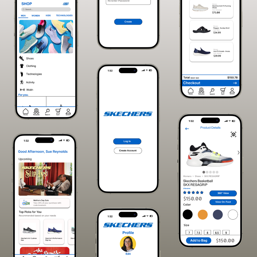
Sketchers ux redesign.
The team aimed to attract a younger, tech-savvy audience for Skechers by modernizing its image. Adding AR try-ons and 3D renders was seen as a way to expand its consumer base. After conducting user interviews, 75% of respondents expressed interest in these features. The team also focused on making the design more visually appealing while keeping it minimalist and easy to navigate, all while maintaining Skechers' current color scheme to preserve brand identity.
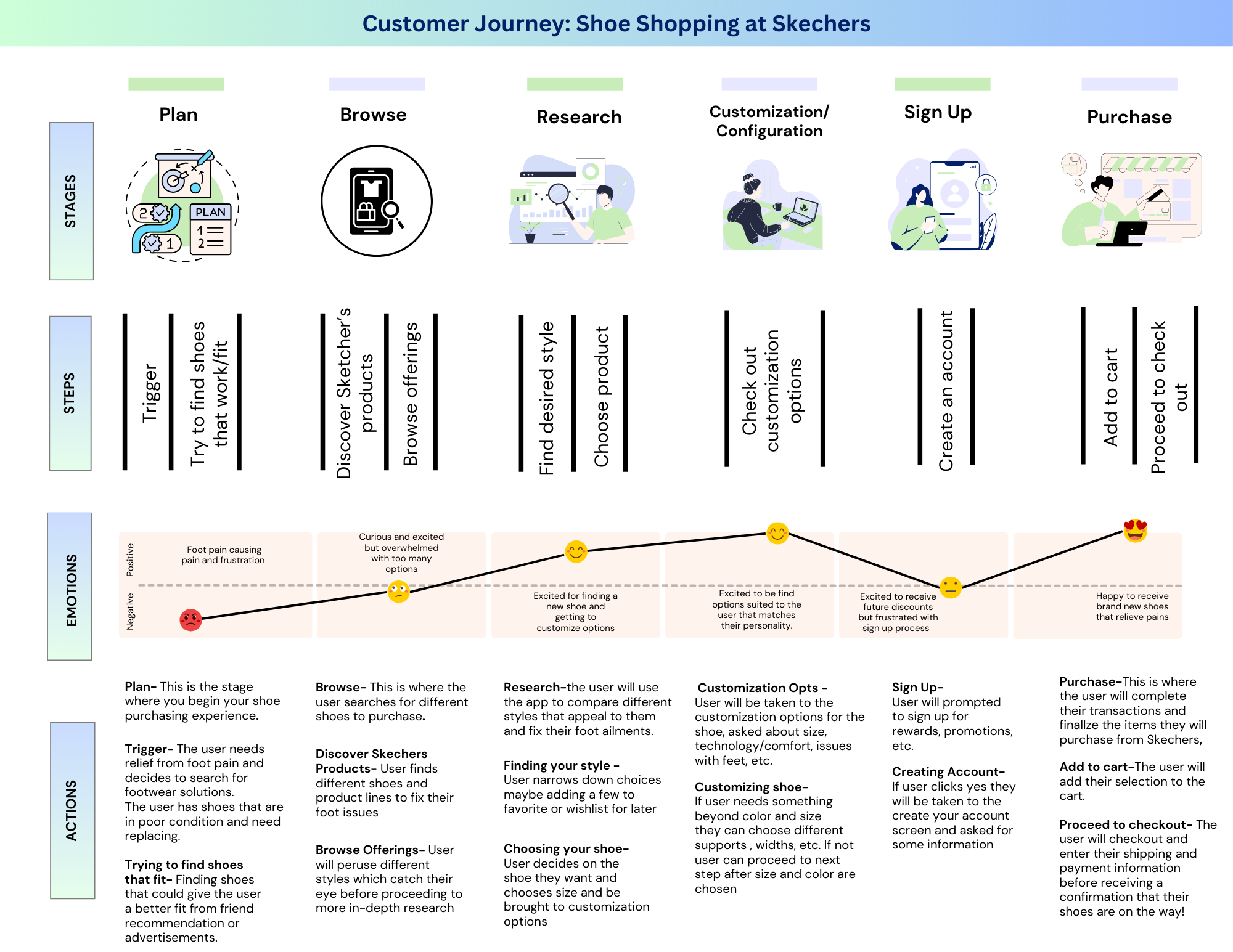
User Journey
-
We mapped the shoe-shopping experience to uncover pain points:
Foot pain often triggers new shoe searches
Users want virtual try-on options at home
Sign-up and rewards pages caused frustration
Opportunities
Offer at-home virtual trials
Modernize the website for younger users
Simplify rewards to reduce friction
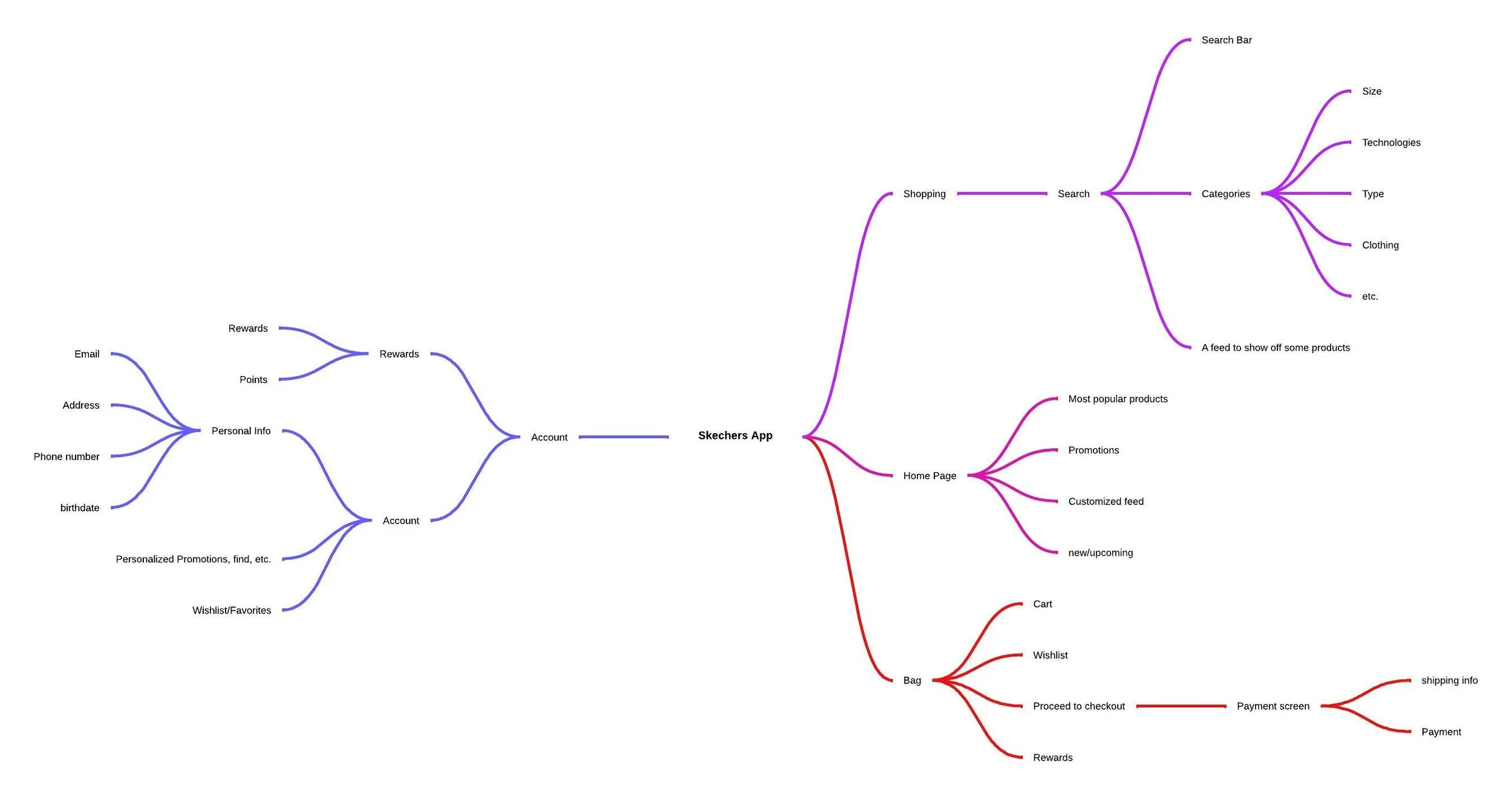
Mind map
-
We used a mind map to organize app features, user needs, and improvement ideas. This helped prioritize updates, streamline the experience, and brainstorm new features like AR try-ons, guiding a more cohesive redesign.
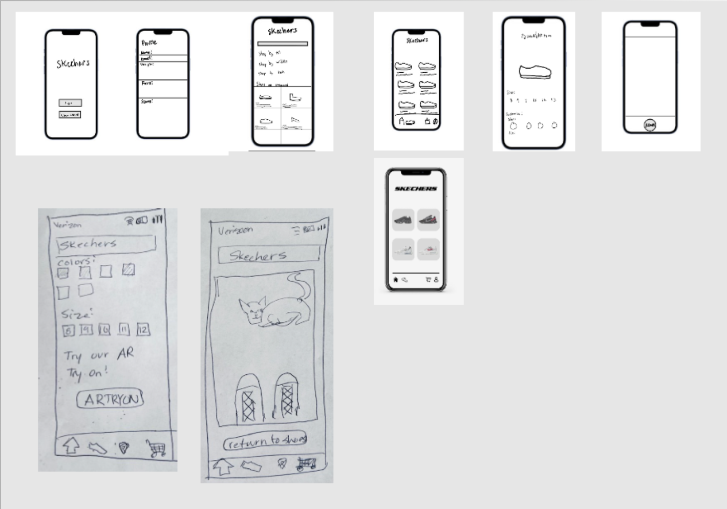
paper prototypes
-
The team created low-fidelity (paper) prototypes to quickly test design concepts for the Skechers app. These prototypes allowed us to gather early feedback on layout, functionality, and navigation before investing time in high-fidelity designs.

My Role
-
Contributed to the customer journey, paper and Figma prototypes, final case study report, and supported additional research.